Photoshop Tutorial - Making a Grungy Business Card
Share this tutorial:
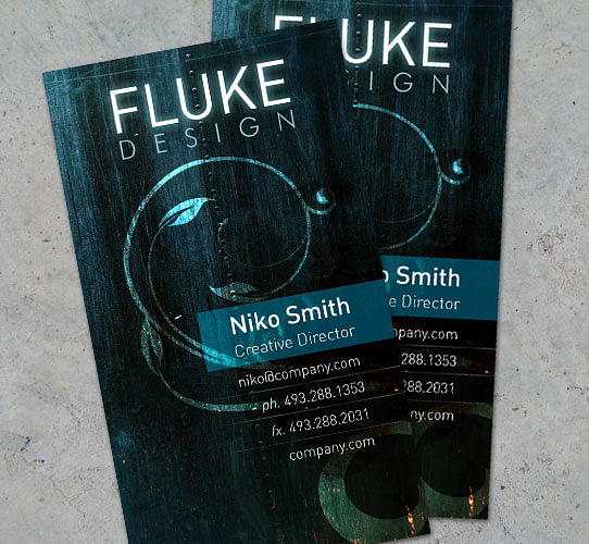
There are many different ways to attack a business card design. Clean & corporate is always nice. But why not get a little wild? This tutorial will walk you through setting up a vertical grungy business card template, front to back and ready to print.
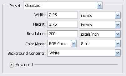
It's important to set up our PSD file correctly right off the bat. The document needs to have an eighth inch bleed area, to ensure our background completely covers the card. So we'll add a quarter of an inch to the width and height of our template. Standard vertical business cards are 2"w x 3.5"h, so our canvas size should be 2.25"w x 3.75"h. Also, change the Resolution of the document to 300 pixels/inch to ensure high quality printing.
Since the cards will be cut after printing, we need to set up guides as a reference to where our artwork needs to be. Click on your left ruler (if your rulers are not visible, press Ctrl + R) and drag a guide an eighth of an inch out. Do this again, this time to a quarter of an inch. Repeat this step for each side of the card.
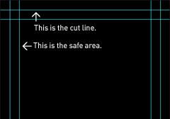
The outside line represents the cut line. Anything printed beyond this line will be cut. The inside line is our safe area. Keep all of your text inside this area. Download the PSD template to see the blank business card template set up with guides.
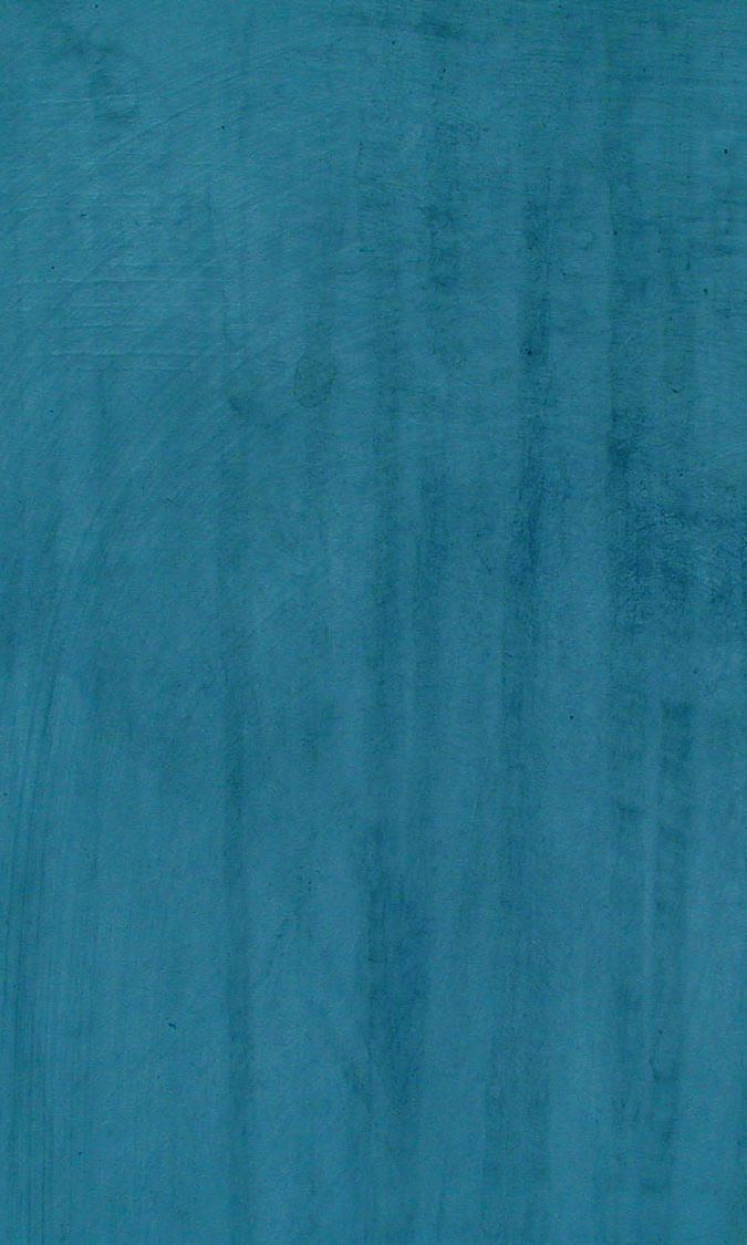
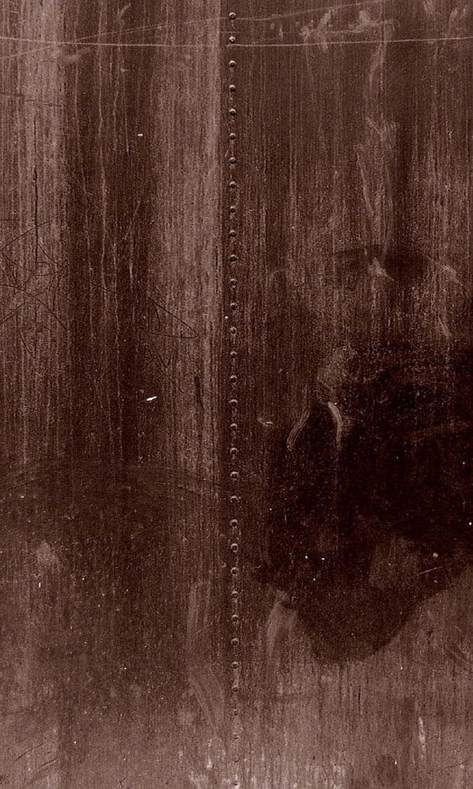
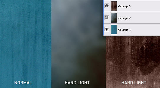
Now that we have the file set up, we're ready to start on the background. We first need to source some stock grungy textures to play with. We'll get a few to layer and create a unique textured background, which you can download below.
Download grunge1.jpg | grunge2.jpg | grunge3.jpg
Place your textures on the canvas, and order them in the layers palette as shown. Also note the blending modes for the top 2 layers. You'll need to set these as Hard Light to blend all of the textures together.
Our next order of business will be to add a decorative element to the background. This could even be a large version of your logo, or another design element you use with your brand. For this we'll use a nice vector floral design. Once you have it positioned above your background textures, change the blending mode to Overlay. This mode makes it looks as if our design has been sand blasted into the dirty wall. It's a little too subtle, so let's duplicate this layer to brighten it up a bit more.

Now position your logo at the top of the card, remembering to stay within the safe area.
Next, grab your type tool and start populating this card with your info. Make your name nice and big, and add your important contact information underneath -- don't forget your website URL too. It's a good idea to keep your smallest font size under 7pt to remain legible. For this example, I've used a clean san-serif font DIN, and set the name in 12pt, the title in 8pt, and the rest 7pt.
Let's add some dividers. Create a small white line beneath your text and extend it to the edge of the document. Blend it in by changing the opacity to 30%. Now duplicate this layer as many times as needed, position them between your text lines, and use your eraser tool with a low opacity to randomly fade out parts, creating a worn look.

Finally, we'll add a translucent box behind the name and title. Pick a light color from our design, in this case #16a0aa, and create a rectangle from the edge of the canvas to just past the name filled with your color. Set the blending mode to Hard Light.

For the back of the card, I like to stay simple. A quick gradient and the logo centered is a nice touch. Once all is said and done, your final step is to convert the document color mode (Image > Mode) to CMYK. Why did we start off in RGB mode? CMYK doesn't offer as many colors to work with. Once your convert to CMYK, you'll notice your design becomes a bit duller. This design holds up well, but sometimes this color mode won't be as forgiving. To fix a muted design after converting to CMYK, increase the overall saturation and contrast -- you should be back in business.

Enjoy this tutorial?
Share it with others who might find it useful!